The day before the presentation...
FEAR... I'm a bit scared and not sure what to anticipate..Im not the best talker in any situation because I'm a very shy person but when put in front I get even more nervous. I sure i will be fine. Its one of those hurdles in life i need to get over and hopefully tomorrow will help and i can walk away proud, knowing that i did my best and i faced my fears. I am pretty prepared and so i am confident that i can do it but i still have this knot in my stomach that i always seem to get. But as always i have faith in myself, I'm determined, i can do this! it sounds stupid for me to get so nervous about it because some people do this so easily. Well maybe with experience and practice i can be one of those people. The only thing that can go wrong is that i stumble on my words and mess it up but all i can do is apologise and return and say it over again.With everything done all i can do for now is WAIT AND SEE! and hope i excel myself.
I have learnt a lot form this project, i think i understand the process of the industry of digital media and i know how to communicate more clearly now than i used to. Before this Module i have never had a blog before and now i feel like i actually know what I'm doing, i think i might even start a new one! with my personal findings and thoughts. And redesigning spam has defiantly been an interesting adventure. Rebranding and designing a product so outdated and well known was pretty hard as it is difficult to keep its original nostalgic feel whilst giving it a fresh new look but i have to say it was an enjoyable experience. I feel we have done a great job of it, I couldn't have asked for a better group! we all worked wonderfully together contacting through, text, email and meeting. putting in equal amounts of effort, no one just sat back and everyone made the effort. I like how our final ideas link together, i think from that you can tell we can had good communication with each other. Id love to work with Lauren and Laura again...any time! :)
Tuesday, 10 January 2012

spam presentation notes
WHY SPAM???
The product Spam has seen a significant decline in sales in recent years.
In order to increase sales, we must give the product a new lease of life – targeting an audience previously unassociated with SPAM.
As a result, we bring you SPAM just for kids.
RESEARCH
From a collective research, we found that Spam had never been aimed at a younger audience. It might seem completely incongruent to aim such a product that carries connotations for an older audience at youngsters, but the concept is completely new and original.
We also noted that in later years, Hormel Corporation tried to fit in with a contemporary scene, buy introducing new versions of the same product relating to a healthier lifestyle; which many people find appealing, but...
...they still hadn’t tapped into the children’s market.
INTENTION
Why did we aim our product at kids?
It gave us free reign to completely regenerate a nostalgic product. And fundamentally it hadn’t been done before. Hormel have aimed Spam at every demographic except for children, presuming that their product is not for them.
Overall, the foundation of our aim was to increase the sales of this declining product, therefore it seemed that taking the children’s route was a gamble we were willing to take to achieve this goal.
DEVELOPMENT
‘SPAM THE HAM THAT CAN’ – In order for this product to appeal to the intended audience, we felt it necessary for a catchy slogan to be introduced.
Considering our target audience, we felt it important that we anchor this idea with a character; SUPER SPAM is the ham that can.
Children find it easier to relate to a fictional character, rather than a brand name or fancy packaging. From our knowledge, other children’s food products are more popular with a character than those who do not have one. Some examples of these include Kellogs Coco Pops and Frosties.
IDEA ONE
With all the given factors from our group research and ideas, it was clearly essential to redesign and develop the packaging to appeal to our new children’s market. It must be visually stimulating to our intended audience, but too appeal to parents, who after all, would be buying the product. Therefore i bring you the New Spam packaging.
It contains all that would be necessary to appeal to our audience as well as containing all the relevant information to attract parents.
It was integral to keep the name the same; redesigning the product does not necessarily mean changing the overall foundations. The nostalgia surrounding SPAM for parents and grandparents alike may indeed encourage them to buy the new product for their children, for them to experience Spam, but in the new generation.
It also seemed to be integral to keep the overall shape the same. Hormel themselves have experimented with many different flavours of Spam, yet the packaging has always remained the same. This way, although the product is aimed at another audience, it can still be associated with Spam.
The colour palette had to appeal to children also, hence the bright, intense colours, children are so easily pleased by. As stated before, it was important to introduce a character for mass appeal, and so this is the main focal point of the packaging.
As a finished design, this would work in a practical way on the shelves, due to the shape and design of the product, of any supermarket to reach our desired goal and appeal to the new children’s market.
IDEA TWO
I wanted to keep the poster design simple and bold so that is stands out to the intended audience. As this was aimed at kids i decided to look at other poster designs like the one for ‘coco pops’ they have a main character in the front and usually keep the background as a bold and bright colour to entice kids to be interested.
This is why i chose the colours i did and had the pig as the main focal point. I looked at how colours affect people and how they work in an advertising way. From this i found that the most exciting colour is red as is increases the pace of your heart. It is also a colour that would be most suits the theme of a super hero ‘super spam’. Children also interact better with simple primary colours as they are the first ones they learn.
The whole concept of my poster is to look like a comic book. This is how i chose the font looking at comic book covers and pop art. It is something that children can relate to.
I kept the character practically the same as the packaging and only changed it slightly to make it more realistic so it stood out on the page. The new packaging is in the picture so that the audience knows what to look for and can see its complete redesign.
I could see this poster being included in children’s magazines and in super markets themselves, it could also be shown on billboards or busses.
IDEA THREE
Spam is a universal product; it’s also a product that is eaten all year round. This reflects in the TV campaign. The campaign starts with the foundation of three adverts, all centred around a particular occasion. We felt it important to market the product around those particular occasions children love and look forward to. These were Easter, Halloween and Christmas.
Three occasions, each fairly spaced throughout the year, would allow us to continue a campaign that lasted the full 365 days of the year. So the product is never forgotten.
The adverts themselves follow the same conventions as the packaging and the posters. The slogan remains the same in every advert ‘SPAM THE HAM THAT CAN’ is featured on the very last frame, with the character we have already talked about, SUPER SPAM.
The choice of colours reflects in the bold and flamboyant palette, same as the packaging. I have tried to use greens, blues, reds, yellows and oranges to show this point. At the same time, I have also tried to arrange the colours so that they fit with the occasions one would normally associate with an occasion; so red for Christmas, for example and green and orange for Easter.
The plot of each advert resembles the occasion also; but still retains, in mind, the target audience. For example, In the Halloween advert, it is set at a children’s party, a setting the can easily be related to by a child. The advert would follow, that SUPER SPAM is hungry, and so walks over to the party food table and cannot find one item. He calls for his mum, whom he asks ‘Where is the SPAM?’ and she brings it to the table, where he takes a bite.
The final frame, which is the same in each ad, then would appear. A white backdrop with Spam’s new packing centre frame; SUPER SPAM, saying the slogan, at which point it would appear on the screen next to him.
The other 2 adverts follow the same pattern. SUPER SPAM is in each of the adverts, as the common thread linking the campaign, through the changing festivals throughout the year. Also whilst SUPER SPAM would still wear his cape, shown here in the packaging, we felt it would be nice to dress SUPER SPAM up as the child may dress up. So, at Christmas we have dressed SUPER SPAM up as Father Christmas, at Halloween, he is a pumpkin (research has shown that at Halloween, some like to add spam to pumpkin dishes) and at Easter, he is dressed as his normal self, with a sash saying ‘Happy Easter’. We wanted to introduce the character without masking him in a costume, for the first advert.
These three adverts symbolise the types of adverts we would create for every other occasion throughout the year as well.
You’ve heard about our campaign, seen our ideas. We believe in this product and its re branding and we hope you do to!
Thank you.
My part is in purple, we all have a different colour to make it easier to read, i think this will defiantly help during the presentation otherwise i would get confused with which part is mine. The good thing is that we all got to chose what parts we wanted to say so it was all fair.
Im happy with the parts i have i don't mind saying a lot as even though i am a nervous and shy person i think it will help to have more experience talking in front of people. It can't hurt! now all i need to do it read through the words a bit more and get used to saying them.
We are putting these words onto card so that they are easier to hold and read otherwise they might flap about. I have some card so i can easily do this.
The Presentation Powerpoint


This was the presentation we made together, we wanted it to be plain and simple as well as a 'straight to the point' powerpoint just showing the headlines of what we will talk about. We thought it would be a good idea to also put the pictures of our final pieces on here as well as on card. I wasn't sure how we should end so i suggested something like 'thank you for listening' or something along those lines. Just to finish it off, to be polite and give a good impression to the client.
Monday, 9 January 2012
Meeting about presentation
We met up to discuss the presentation and what we wanted to say / how we would present it.
We started by choosing the background and writing the titles on the powerpoint. We chose a background that was simple and not to overpowering so that the audience could concentrate on what we would be saying. We then began writing simple text of each title, Research, Development, Intention, Idea one, Idea two, Idea three.
From there we just wrote lines together trying to put as much equal input as we could. I suggested a few ideas as to what to write, i tried my best to help out. After we wrote all of the group words and separated each persons part into a different colour we then moved on to the individual explanations.
We decided to also have handouts and boards with our ideas on. Originally we wanted to have one board for each persons ideas and put the initial ideas and final idea on the same A3 card. As Lauren's got three ideas she suggested that it might looked cramped on one page so she should put hers on individual pages. This made sense to me and i suggested why don't we just put the initial ideas and the final idea on separate pages for me and Laura too as this would look better. They both agreed to this and we then carried on with the handouts. Fo the handout we just put all of the final designs onto one page, in order of how they would be created in the industry. It started with the redesign of the packaging, then the poster designs and finally the tv advertisements.
Then we all went our separate ways with jobs to do. I was to print off the page of my words and stick it on some white card in preparation of the presentation. This was a helpful meeting as i feel much more prepared and now know what i am doing.
We started by choosing the background and writing the titles on the powerpoint. We chose a background that was simple and not to overpowering so that the audience could concentrate on what we would be saying. We then began writing simple text of each title, Research, Development, Intention, Idea one, Idea two, Idea three.
From there we just wrote lines together trying to put as much equal input as we could. I suggested a few ideas as to what to write, i tried my best to help out. After we wrote all of the group words and separated each persons part into a different colour we then moved on to the individual explanations.
We decided to also have handouts and boards with our ideas on. Originally we wanted to have one board for each persons ideas and put the initial ideas and final idea on the same A3 card. As Lauren's got three ideas she suggested that it might looked cramped on one page so she should put hers on individual pages. This made sense to me and i suggested why don't we just put the initial ideas and the final idea on separate pages for me and Laura too as this would look better. They both agreed to this and we then carried on with the handouts. Fo the handout we just put all of the final designs onto one page, in order of how they would be created in the industry. It started with the redesign of the packaging, then the poster designs and finally the tv advertisements.
Then we all went our separate ways with jobs to do. I was to print off the page of my words and stick it on some white card in preparation of the presentation. This was a helpful meeting as i feel much more prepared and now know what i am doing.
Planning the presentation
RESEARCH-
The research we all looked at as a group, images, internet etc.
DEVELOPMENT-
INTENTION-
Our intention, like our audience being children.
THREE IDEAS-
Each persons Final idea and a written statement about our personal individual developments.
Peer assessment 14/12/11
I found this hard as I'm not used to marking and judging others. I don't like to upset people and i don't really feel i have enough knowledge and experience as to what should be in others work, I can only assume myself. It defiantly helped to look at the marking criteria and also what others have and don't have as it made me understand what should be in my blog and sketchbook. I found that i needed more research and to evaluate others work. which i have done since. overall i found this was a difficult and different situation but a very helpful one.
My groups work
Lauras - This is Laura's redesigning of the packaging, she chose to to this as she is more of a technical drawer, she prefers to design than to make an tv advert or radio advert. She had three idea and has developed one into a final idea. She has created a character similar to mine but more cartoon-like. I like how Laura has changed the shape of the packaging it is more appealing as the original spam resembles cat food. I also like the way she was decided to appeal to the contemporary market by advertising the fact spam now has 50% less fat.

Lauren - Lauren has created a tv advert. She has a series of three final adverts and also had some rough ideas and drawing of different adverts. These are her three final ideas. We had spoke previously about having the character change when ever there is a different holiday, like christmas or easter. This is what she has created with her adverts. Three different scenarios involving the pig and three different holidays. I really like the cute costumes they will defiantly be very interesting to children.
We have all intertwined our projects to create one big project. I like how we have not only worked well as a group and all supported and have put the same about of input into the project as a whole but we have all taken different routes and put effort into our work individually.
The New Spam
MY POSTER DESIGN

This is the final design. I incorporated Laura's redesign of the packaging as it is a total relaunch of Spam i needed to show the new child friendly packaging with my poster. I used pen all the way through to highlight the picture and add detail and because it makes it look more comic- like. As you can see i used the font that i research and as an added touch i drew a action effect on the can. The red background looks much better and really makes it pop. This combination of colours worked well aesthetically and is also great for children as they are all primary colours.
My research really helped me to define my poster and make it better. I found it very helpful and i am pleased with the outcome.
I can see this in billboards, supermarkets and magazines. If it were in magazines it might be a good idea to put it in food magazines, mums read these and try to get ideas so if they see the advert and see that the picture says 50% less fat they may be enticed, after all the parents will be the ones buying the product not the children we need their approval. It would also be a good idea to put it in children magazines to get their attention as this is our target audience. If is is advertised in supermarkets the children will see it and the appealing character and colours and will persuade the parents to buy it so this would also be a good idea.
Development for spam

This page is a development of font. I didn't like the one i was currently using and because my poster is based on the theme of comic book super hero's and my character is 'super spam' i needed a font that suited that. The two i chose were inspired by superman comic books and roy Liechtenstein's pop art.

I felt the colours of my original design were too wrap and not eye-catching enough. So i did some research on colours and their meanings and messages in advertising.

FRom this research i recognised that the colour most children like are primary colours and in particular the colour red. The colour red raises your heart rate and therefore makes things seem more exciting.

I tried the three colours chose in different aspects but i felt that the red background looked the most aesthetically pleasing. Not only that but it looked very comic book- like. The red and blue are superman colours and would be recognisable to children and superhero colours. blue is also a colour that represents loyalty and is great because spam is just a nostalgic name that goes back a long way, it is a loyal name.
My SPAM poster designs
THE ROUGHS
These are the rough designs for my poster for spam. Using the pig as a sort of mascot. I just drew them using pencil as a sort of rough idea of the shapes i wanted.

This is my first design. As i looked at the use of font in posters i decided to use this is my own work and have the majority of the poster as font, and a little pig character in the corner. I hadn't developed the character yet so it was still a very simple character. I liked the font but i thought it was perhaps too much. I made sure it said it had real pork as this is what parents look out for, things that are healthy for their children.

With this one i decided to see what a poster would look like with an example of what the food could be served in. Still using font as part of the image. I liked this one but wasn't sure about the entire image there was something about it that wasn't quite right. The slogan wasn't catchy enough. I Had however developed the pig, i looked at what Lauren's advert designs and she wanted to use a more realistic pig. So i decided to use a similar pig to tie into their designs. He is still cartoony but a little more realistic that the last, with makes him look more cute and appealing to children. I messed up the font at the bottom as i was experimenting with different mediums and i used water colour and oil pastels, as the paint was still wet the pastels didn't go on very well. It looks nicer when you use pencil and pen, gives a more professional finish.

This was my chosen idea I liked the composition on this one the most and the text works the best and it has a catchy slogan. The character in this one is dressed in a supper man costume but its a super spam costume. i think this will appeal to kids as its fun and quirky. It also has a opportunity to show off the new spam can which will add interest. i used pen and pencil as it works best i like the look of this one but think it needs to be a different colour as i don't think it is 'wow' enough the blue doesn't stand out and it could do with some different font types.

SUPER! Research on the comic book style
These are some images that i have collected because i want my poster to have a comic book style to go with the character 'super spam' and the slogan 'Spam the ham that can'.


I was also inspired by Roy Lichtenstein's pop art.


Here is the type of font i want in incorporate into my design.


From this research i have gathered i can think about the type of font i want, it needs to be bold and colourful. I can also think that in order to get the full look i need to use fine liner pens and shading detail.
Wednesday, 14 December 2011
A SPAMMY joke
Only in America :)
there is a spam museum, it just shows there must be a market out there for spam.
www.roadsideamerica.com

there is a spam museum, it just shows there must be a market out there for spam.
www.roadsideamerica.com

SPAMsearch
RESEARCH for SPAM
cans-


cans-
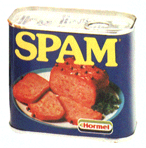
This Spam can isn't very appealing, it sort of looks like cat food tin. The picture on the front isn't too appetising
but it probably looked to in those days as it looks quite traditional.


There are quite a few different types of spam, lots of colours and flavours.
Even so it still needs a good redesign, it looks so outdated even the most recent one looks like something from the 70's. None of these are aimed at kids, i find that strange that they has tried everything but that. Maybe thats exactly what they need some fresh tastebuds! A completely new audience.
SPAM posters-
some posters that might help with my own poster.


These two are quite old posters. i like the slogans and the funny quotes but the pictures are quite outdated for modern times. They are bland and dull. Its a good idea to show the recipe though.

This is they're most recent poster, its a lot better than the later ones but it still doesnt have much appeal. Although it probably appeals more to the modern market than it did with the burger bun and the fresh bright colours. I'm not sure about the blue. They still need something fresh and new! which hopefully i can provide.
Monday, 12 December 2011
The premier of a sweet surprise...
It definitely was a sweet surprise! we showed our film to the class, i admit it was hard to keep the giggles in. Seeing myself in pigtails and trying to act was a sight i wasn't used to seeing. In my opinion it looked good..better than i had first thought. It had some nice shots and was quite sweet. It lived up to its name!
I found the feedback helpful, i can see that it needed to have more of a 'bang' to the story line, something to catch the viewers attention. The good thing id say is that it did flow nicely and as a said before it was sweet and enjoyable to watch. Also the camera was held steady by Lauren which was great and the shots where great. The parts where we were walking down were perhaps too long but if i had the opportunity to edit these they would fit in more with the rest on the film. I love our story line, its simple and sweet... i think that i fit the brief perfectly and was interesting to watch. It could have been more interesting but thats for a later date, you live and learn. I enjoyed the whole experience, i have never made a film before and it gave me a better understanding of the process.
The filming of 'a sweet surprise'
It began very well, we were all prepared had all our props and equipment. only problem was that we had different bracelets than we originally planed but that wasn't really a problem. I was acting in the film, so i had to dress up as a school girl with my hair in bunches. It was hard in the beginning because there was a scene with me and Laura trying to act childish, i literally couldn't stop myself from laughing at one point. I wouldn't say i was a born actress but i did my best. I thought of something sad and tried my best to hold the giggles in. There was a slight slip up (excuse the pun) when there was a close up of me, as the camera zoomed in on my face Laura slipped up on a piece of paper as she was trying to exit, this made me laugh. Luckily it sort of looked like i was crying as i tried my best not to smile. we also had some problems with the camera, it kept on going fuzzy and didn't want to focus on anything. Early on Lauren fixed it so it didn't effect the majority of our film. One thing that did get annoying is the way people reacted to the camera, no one wanted to be filmed and they got very irate about us getting in there way. Some people made rude comments but i just ignored them and we waited till the shot was clear till we filmed. i thought there might have been a problem with filming in the sweet shop but we asked inside and the girl was very nice she said we could do what ever we want as long as we didn't film her. It was a good job we asked. i learnt that when filming you have to be very prepared and have it all planned out. You have to be patient and understand that people really don't like to filmed and they don't usually care if they ruin your shot or not so you just have to wait for them to leave. Also to be polite if you are going to film outside or inside someones shop you should ask first as you will get a much better response. WE walked past another group that were filming down the alley that was next to someones house, they didn't let him know what they were doing. The man came out very angry and rude he asked lots of questions and wasn't very happy. He didn't seem like he liked students very much anyway but he might have been a bit more accepting if they told him first.
SPAM the ham that can
My learning group is Me, Lauren and Laura. WE are recreating SPAM which i am happy about as it is so outdated it needs a lot of work! I am going to try and bring it back to life with a poster design. I chose posters as i am an illustrator and i can create a great illustration to go on the poster. We decided to aim it at children as spam hasn't done this yet, and we are going to use a pink pig as a sort of mascot. He is a super hero pig, which kids will like and his catchphrase is Spam the ham that can! i love it. Im really happy with our choice of spam i think theres a lot i can do with this.
Friday, 9 December 2011
SPAM website
I had a look at the spam website to get some information, here is is - www.spam.com
I found out that they have many different versions of spam like low in salt, spam with cheese, spam with garlic.. they even have clothes with spam written on them. They only thing they don't have is any spam directed at children, its all for adults. It would be a good idea to do this.
They have very modern recipes of what you can create with spam, these include casserole, salsa burgers, pasta dishes, pizza and lots more.
You can tell that spam is trying to appeal to the modern more young market but they aren't doing too well because they haven't changed anything the packaging or the advertising. Spam isn't really advertised at all, I've never seen any personally.
This shows there is real need for a redesign on the product in order for the product to really get hold of a younger audience.
Wednesday, 7 December 2011
A meeting with a difference
We had all met up on the 22.11.11 to talk about our projects together. We started to talk about our recent film project which i had created a story board for. Since Lauren wasn't there we had to explain the brief and show the storyboard and shot list to her so we all worked together as a team. She could then write out the treatment for the film through what we had shown her.
We then talked about the various things we need to do for the film. I suggested that at the end of the film we should do a shot of us from behind on the bench as this would make an eye-catching view. we talked about what clothes we were going to wear for the child part. Laura suggested wearing her hello kitty jumper and i said that i would wear a standard blue jumper as i didn't have anything child-like but this looked closest to a school jumper or something. I had planned to get some bracelets to represent friendship bracelets but i wasn't able to buy any in the end. Luckily Lauren had some similar looking bracelets that we used which actually turned out to be a better idea in the end as they were bigger and easier to see when filmed. lastly we talked about the length of each shot, we all agreed that the walking scenes would be shorter than the rest as they were just to show that we were walking towards the same place but just missing each other. We all felt like we were organized enough to start filming on wednesday. I found this talk really helpful, we had obviously been emailing but to meet in person just brought everything together. All our ideas were out in the open and we then decided on a definite plan of action.
We briefly discussed our progression of the spam project. I said that i had done some research and rough ideas but needed to draw up some ideas in colour. Laura said that she was going to base her idea on the phrase 'Spam the ham that can!' i loved this idea and thought i would be a great idea to use this in my poster designs to link all our ideas together.
overall a really helpful meeting!
here is the story board i brought to the meeting-


We then talked about the various things we need to do for the film. I suggested that at the end of the film we should do a shot of us from behind on the bench as this would make an eye-catching view. we talked about what clothes we were going to wear for the child part. Laura suggested wearing her hello kitty jumper and i said that i would wear a standard blue jumper as i didn't have anything child-like but this looked closest to a school jumper or something. I had planned to get some bracelets to represent friendship bracelets but i wasn't able to buy any in the end. Luckily Lauren had some similar looking bracelets that we used which actually turned out to be a better idea in the end as they were bigger and easier to see when filmed. lastly we talked about the length of each shot, we all agreed that the walking scenes would be shorter than the rest as they were just to show that we were walking towards the same place but just missing each other. We all felt like we were organized enough to start filming on wednesday. I found this talk really helpful, we had obviously been emailing but to meet in person just brought everything together. All our ideas were out in the open and we then decided on a definite plan of action.
We briefly discussed our progression of the spam project. I said that i had done some research and rough ideas but needed to draw up some ideas in colour. Laura said that she was going to base her idea on the phrase 'Spam the ham that can!' i loved this idea and thought i would be a great idea to use this in my poster designs to link all our ideas together.
overall a really helpful meeting!
here is the story board i brought to the meeting-


I found it quite hard to create these as its hard to picture what you want in your head and then put it onto paper not only that but its even harder to draw what my group imagine. There were quite a few frames but i got it done in the end. My group seemed happy with what i had done, Lauren had said she liked the second to last image as she didn't think of that angle. Its funny how we all imagine different things. I did talk it through before hand and lauren gave me a sheet with all the shots written down before i started so i think its pretty well planned! :)
Wednesday, 23 November 2011
Pick and Mix
This is the name of our picture gallery website. We decided on the name Pick and Mix as we didn't want a specific theme, we wanted it to be full of random images that we liked hence 'pick' and 'mix' as this was different to anything anyone else was doing. there were little coloured squares with names home, image one, image two etc. They all linked up to a page and every page was linked.


When we showed the website to everyone in the class, we were picked up on the white background. I think we chose this because we wanted the squares and images to standout and i do think it works. it works better on a screen than projected on a wall. It might have still looked good with different coloured backgrounds, perhaps thats something we should have tested.
Everyones websites looked great, i was really impressed with them all. i think everyone was at the same sort of level though. i wouldn't say any stood out more than others particularly.
Everyones websites looked great, i was really impressed with them all. i think everyone was at the same sort of level though. i wouldn't say any stood out more than others particularly.


Photoshop is complicated
We were given one non edited picture that badly NEEDED editing! so we got to work.
we cropped and saved, changed and saved and so on. as a group we changed the contrast and the colour, we made the gold brighter and other parts darker. Id say it looks good now like something out of a travel magazine. I think we got the just of photoshop! its complicated.


Subscribe to:
Posts (Atom)