Monday, 9 January 2012

The New Spam

MY POSTER DESIGN 


This is the final design. I incorporated Laura's redesign of the packaging as it is a total relaunch of Spam i needed to show the new child friendly packaging with my poster. I used pen all the way through to highlight the picture and add detail and because it makes it look more comic- like. As you can see i used the font that i research and as an added touch i drew a action effect on the can. The red background looks much better and really makes it pop. This combination of colours worked well aesthetically and is also great for children as they are all primary colours.

My research really helped me to define my poster and make it better. I found it very helpful and i am pleased with the outcome.

 I can see this in billboards, supermarkets and magazines. If it were in magazines it might be a good idea to put it in food magazines, mums read these and try to get ideas so if they see the advert and see that the picture says 50% less fat they may be enticed, after all the parents will be the ones buying the product not the children we need their approval. It would also be a good idea to put it in children magazines to get their attention as this is our target audience. If is is advertised in supermarkets the children will see it and the appealing character and colours and will persuade the parents to buy it so this would also be a good idea. 

Development for spam


This page is a development of font. I didn't like the one i was currently using and because my poster is based on the theme of comic book super hero's and my character is 'super spam' i needed a font that suited that. The two i chose were inspired by superman comic books and roy Liechtenstein's pop art. 


I felt the colours of my original design were too wrap and not eye-catching enough. So i did some research on colours and their meanings and messages in advertising.


FRom this research i recognised that the colour most children like are primary colours and in particular the colour red. The colour red raises your heart rate and therefore makes things seem more exciting. 


I tried the three colours chose in different aspects but i felt that the red background looked the most aesthetically pleasing. Not only that but it looked very comic book- like. The red and blue are superman colours and would be recognisable to children and superhero colours. blue is also a colour that represents loyalty and is great because spam is just a nostalgic name that goes back a long way, it is a loyal name.

My SPAM poster designs

THE ROUGHS 

These are the rough designs for my poster for spam. Using the pig as a sort of mascot. I just drew them using pencil as a sort of rough idea of the shapes i wanted. 


This is my first design. As i looked at the use of font in posters i decided to use this is my own work and have the majority of the poster as font, and a little pig character in the corner. I hadn't developed the character yet so it was still a very simple character. I liked the font but i thought it was perhaps too much. I made sure it said it had real pork as this is what parents look out for, things that are healthy for their children.


With this one i decided to see what a poster would look like with an example of what the food could be served in. Still using font as part of the image. I liked this one but wasn't sure about the entire image there was something about it that wasn't quite right. The slogan wasn't catchy enough. I Had however developed the pig, i looked at what Lauren's advert designs and she wanted to use a more realistic pig. So i decided to use a similar pig to tie into their designs. He is still cartoony but a little more realistic that the last, with makes him look more cute and appealing to children. I messed up the font at the bottom as i was experimenting with different mediums and i used water colour and oil pastels, as the paint was still wet the pastels didn't go on very well. It looks nicer when you use pencil and pen, gives a more professional finish.


This was my chosen idea I liked the composition on this one the most and the text works the best and it has a catchy slogan. The character in this one is dressed in a supper man costume but its a super spam costume. i think this will appeal to kids as its fun and quirky. It also has a opportunity to show off the new spam can which will add interest. i used pen and pencil as it works best i like the look of this one but think it needs to be a different colour as i don't think it is 'wow' enough the blue doesn't stand out and it could do with some different font types.

SUPER! Research on the comic book style

These are some images that i have collected because i want my poster to have a comic book style to go with the character 'super spam' and the slogan 'Spam the ham that can'. 


I was also inspired by Roy Lichtenstein's pop art.


Here is the type of font i want in incorporate into my design.


From this research i have gathered i can think about the type of font i want, it needs to be bold and colourful. I can also think that in order to get the full look i need to use fine liner pens and shading detail. 

Wednesday, 14 December 2011

A SPAMMY joke

Only in America :)

there is a spam museum, it just shows there must be a market out there for spam.

www.roadsideamerica.com

SPAMsearch

RESEARCH for SPAM 


cans-


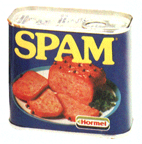
This Spam can isn't very appealing, it sort of looks like cat food tin. The picture on the front isn't too appetising 


but it probably looked to in those days as it looks quite traditional.


There are quite a few different types of spam, lots of colours and flavours. 
Even so it still needs a good redesign, it looks so outdated even the most recent one looks like something from the 70's. None of these are aimed at kids, i find that strange that they has tried everything but that. Maybe thats exactly what they need some fresh tastebuds! A completely new audience. 

SPAM posters-


some posters that might help with my own poster.


These two are quite old posters. i like the slogans and the funny quotes but the pictures are quite outdated for modern times. They are bland and dull. Its a good idea to show the recipe though.


This is they're most recent poster, its a lot better than the later ones but it still doesnt have much appeal. Although it probably appeals more to the modern market than it did with the burger bun and the fresh bright colours. I'm not sure about the blue. They still need something fresh and new! which hopefully i can provide.


Monday, 12 December 2011

The premier of a sweet surprise...

It definitely was a sweet surprise! we showed our film to the class, i admit it was hard to keep the giggles in. Seeing myself in pigtails and trying to act was a sight i wasn't used to seeing. In my opinion it looked good..better than i had first thought. It had some nice shots and was quite sweet. It lived up to its name!

I found the feedback helpful, i can see that it needed to have more of a 'bang' to the story line, something to catch the viewers attention. The good thing id say is that it did flow nicely and as a said before it was sweet and enjoyable to watch. Also the camera was held steady by Lauren which was great and the shots where great. The parts where we were walking down were perhaps too long but if i had the opportunity to edit these they would fit in more with the rest on the film. I love our story line, its simple and sweet... i think that i fit the brief perfectly and was interesting to watch. It could have been more interesting but thats for a later date, you live and learn. I enjoyed the whole experience, i have never made a film before and it gave me a better understanding of the process.